GE Copywriter
When photography and design go hand in hand to create strong Brands.
One of the biggest problems business owners face when first starting out is that they tend to think of branding as a logo. In fact, branding has a number of different interpretations and elements, from the specific – a colour scheme – to the more intangible – a feeling associated with that business.
As a graphic designer and photographer, I am able to bring together a number of elements to create a cohesion of both image and perception, as I did with Gayle Edwards from GECopywriter.
Finding something you like
GECopywriter had been running as a business for 6 years, and in that time already had 2 different logos. As Gayle said, “I know what I don’t like, but I can’t tell you what I do like. Only, it shouldn’t be pink, green or involve a pen.”
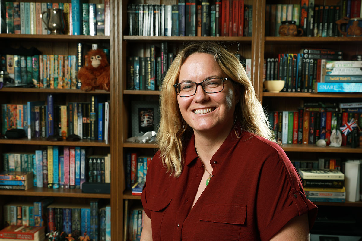
As a digital copywriter, a keyboard was far more appropriate an association for Gayle than a pen, but this image is too often used for web developers. It didn’t have the creative writing element of a copywriter. After a long conversation, I also felt the existing headshots Gayle didn’t display her personality, being a little too formal and corporate.
The graphic design
Gayle and I went through an extensive conversation about her business, her aims and how she interacts with her clients. It gave me a very strong view of how she worked, and her style of communication. I also go through a colour analysis process, choosing the colours she both liked the most, and have positive connotations for creativity.
Then I put together a mood board of potential logos and a new website page design, which incorporated elements of content from the existing site but with a modern style. I found samples of the types of image that would go with the design. And then, sent it over to Gayle.
The photography
Of course, there was a little to and fro’ing as we tweaked the design, and added and discarded elements. We ended up with a strong design that represented writing and used Gayle’s initials, bright non-corporate colours and a completely revamped webpage design.
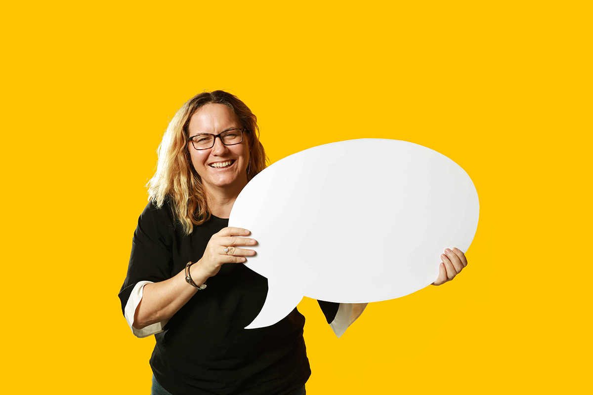
The benefits of creating both graphics and photography myself is that I understand exactly what I want when it comes to the photos to fit into the page. For example – an image of Gayle on her new brand background, no clutter, and positioned on one side to allow room for some wording – which meant I knew how I needed her to stand in the photo before I even started the shoot.
And, as there were no need for extensive conversations, meetings and sign offs by different departments – graphics, branding, photography and so on – the process was both swift and cost-effective.
Finally – a great new Brand
The outcome – a fresh, modern brand that demonstrates Gayle’s creativity, natural personality and that contains absolutely no pens.
The website both complements the style and uses the brand colours throughout, and Gayle has a clear idea of her own style to carry on within her social media and marketing.
“Tina is a fabulous and creative photographer. After a very general chat about how my website and brand was just not working for me, she came up with some brilliant designs and ideas. She understood what I wanted, when I didn’t know myself, and put it all together. The photo shoot was very easy going, friendly and I didn’t feel uncomfortable at any point..”
Gayle Edwards – GECopywriter


